Course on Information Design and Data Visualization
Bigger and more complex data-sets have led to an increased interest in the field of data visualization, or graphic representation of data. To accurately present data visually is a powerful way to communicate to a more general audience.
With an ever increasing load of information it is imperative that we as researchers find effective ways to communicate our results to everybody, and not just our fellow researchers trained in epidemiology. I wanted to learn how to use these tools to effectively communicate results from epidemiological research, and therefore attended a one week curse in Information Design and Data Visualization at University of the arts London Central Saint Martins this summer.

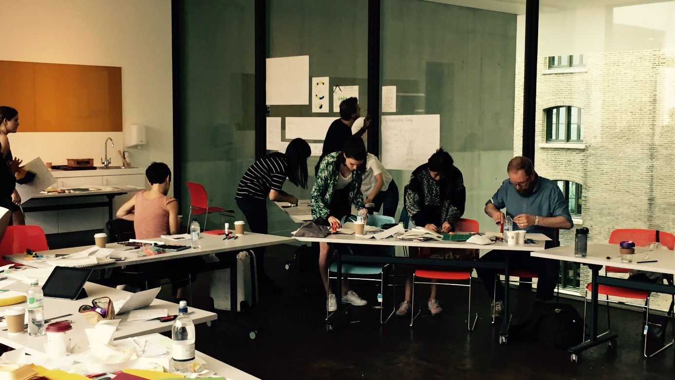
The course gave us insight in the exciting, but challenging, interplay between design and science. It was divided between lectures, group critics/discussion and hands-on-workshops. The emphasis was not to learn any specific software or technique, but rather to teach designers to think like scientists, and scientists to think like designers. The group of students also had a very varied background, from epidemiologists at the London School of Hygiene to graphic designers.
One of the most useful parts of the course for me was how to use design principles to show patterns in datasets. We as researchers use statistics to find these patterns, but the challenge often remains how to show these patterns to others. The gestalt principles of visual perception proved to be a very useful toolbox when organizing visual information. This theory explains how people tend to organize visual information into groups or “unified wholes” by the use of proximity, similarity, enclosure, closure and continuity. These principles can be used by the designer (or epidemiologist) to create visual stories from our data.
I highly recommend this course to all my fellow EPINOR-students who are interested in this fascinating intersection between art and science.
Alf Inge Hellevik
PhD-student NTNU
Last updated: 28.02.2017 08:34